The Oils of Olive of Spain première new image of mark to conquer the world-wide markets
9 April 2013
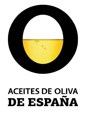
The new image has been designed by one of the companies of branding with greater prestige and international experience, with the premise to attract the attention of the viewer and to transmit a series of own positive values of our oils of olive. The new mark trasmite the Spanish origin of the product dragging the positive and vital character quenos defines, communicates leadership with a simple and powerful image, contains the balance that combine tradition and modernity, two concepts that define our sector and the flexibility and versatilidad intrinsic to the oils of olive.
The mark does direct reference to the product, with a yellow colour that also remits us in the sunlight of Spain. Like this the white, the black and the yellow form a composition sobria, but harmonious and elegant. Besides, the rotundity of the stroke transmits feeling of solidez and solvencia. It gives importance to the 'or' of olive and of 'olive oils' together with the photography of the oil, representing of way almost literal the meaning of the company and product.