This news article was originally written in Spanish. It has been automatically translated for your convenience. Reasonable efforts have been made to provide an accurate translation, however, no automated translation is perfect nor is it intended to replace a human translator. The original article in Spanish can be viewed at Frescura, calidad y selección se aglutinan en el nuevo logotipo de Fruit Logistica
Freshness, quality and selection agglutinate in the new logo of Fruit Logistica
09/04/2013
9 April 2013
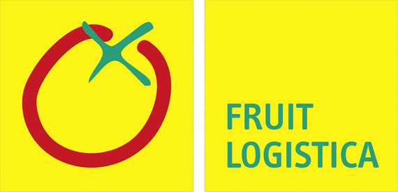
To few weeks to begin the world-wide campaign of promotion, Fruit Logistica present his new logo. It gathers elements of the previous logos and the revaloriza of recognizable form. At the same time it arises, by means of the reduction of the most essential, his projection to the future and the elegance of his design.
His horizontal outline, that consists of two square ordered one beside the other, achieves a more flexible format to adapt to the diverse media. His yellow alive colours, green and red reutilizan in this new version of the logo. The striking colours and the forms reduced reflect the values that stand out in Fruit Logistica: freshness, quality and selection.
At the same time that it presents the new logo, relanza the web page, adapting the same to this new image.
Related Companies or Entities
Messe Berlin GmbH